"Visualization and belief in a pattern of reality activates the creative power of realization."
A. L. Linall, Jr.
Faced with an ever-increasing capacity to collect and store data, organizations must find a way to make sense of it to their advantage. Methods are required to simplify the data so that it can inform strategic decisions and help solve problems. Visualization tools are becoming increasingly popular since they can display complex relationships in a simple, visual format.
This article describes Bloom, a project at Carleton University to develop an open source visualization tool for complex networks and business ecosystems. It provides an overview of the visualization technology used in the project and demonstrates its potential impact through a case study using real-world data.
The Bloom Project
Bloom was initiated in the spring of 2010 by graduate students in the Technology and Innovation Management program (TIM) at Carleton University in Ottawa. The project's mandate is to use open source visualization tools and techniques to develop a platform to visualize the structure and relationships within complex networks. A web-based prototype was developed using a combination of open source tools, including Prefuse-Flare, MySQL, Glassfish, and Eclipse. These tools were chosen because of their maturity and flexibility. When combined, they enabled rapid development of a new visualization prototype that can be readily customized.
The main component of the platform is Prefuse-Flare, an open source visualization project that began at Berkeley University. As described on the Flare website: “Flare is an ActionScript library for creating visualizations that run in the Adobe Flash Player. From basic charts and graphs to complex interactive graphics, the toolkit supports data management, visual encoding, animation, and interaction techniques. Even better, flare features a modular design that lets developers create customized visualization techniques without having to reinvent the wheel.” Flare provides the baseline visualization capabilities to which customizations will be added as the project proceeds and its technical requirements are refined.
Prototype Overview
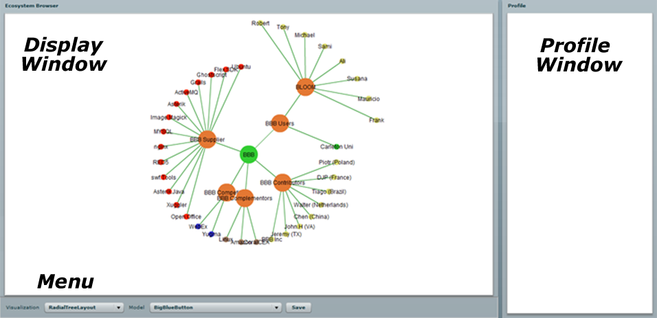
To test the platform prototype and its capabilities, data were gathered from the business ecosystem surrounding BigBlueButton, an open source web conferencing solution. Here, these data are used to demonstrate the basic functionality of the visualization tool (Figure 1).
The interface is separated into three main areas: the display window, the profile window, and the menu. In the display window, the data are visualized and the user can explore the output by selecting items on the displayed structure. The profile window displays relevant information regarding the selected item. At the bottom of the screen, the menu provides options for changing the display type and data source. Figure 1 shows the Radial Tree layout. Other available display types include: Circle (Figure 2), Indented Tree (Figure 3), and Node Link (Figures 4 and 5).
Figure 1. Bloom Prototype: Visualization Tool Interface
Case Study
A case study was developed in collaboration with the Ottawa Centre for Research and Innovation (OCRI). This presented an opportunity to assess the scalability of the tool by creating a visualization of a large, complex network. OCRI maintains a database of 1,900 members, representing over 7,000 registration records. The case study also provided direct interaction with users; their interpretations and feedback would allow the team to focus further refinements of the tool. Following a positive case review with members of OCRI’s executive team, subsequent sessions were scheduled to drive refinements of the tool to meet their specific needs.
Figure 2 shows OCRI’s network of 18 high tech industry sectors, displayed using the prototype visualization tool. Each circle represents a sector and is sized according to the number of connections to other sectors. For example, the Contact Centre sector has fewer interconnections than the Cleantech sector and it is accordingly smaller in the visualization. The width of the lines that connect the sectors increase based on the number of companies that are included in the relationship. The Knowledge and Support Services sector has the largest number of relationships, while Contact Centre is one of the smaller sectors. The visualization also shows that there are strong ties between the Knowledge Support Services sector, the Software sector, and the eBusiness sector.
Figure 2. Bloom Prototype: Circle Display of OCRI Member Relationships

This case study demonstrates the capability of the tool to display and manipulate information. For example, a user can select different displays to explore the data and choose a representation that matches their own conceptual model. By selecting an industry sector and dragging it across the screen, a user can highlight and extract information specifically related to that sector. As shown in Figure 3, the Cleantech sector has been selected and now shows the strength of its relationship to other industry sectors.
Figure 3. Bloom Prototype: Indented Tree Display of Cleantech Sector

The user can drill down into the data to display additional details regarding the company member registrations in the industry sub-sectors. Figure 4 shows a Node Link display of the Cleantech sector, which allows the user to see that the Cleantech industry has been subdivided into seven sub-sectors with strong relationships to ‘Clean Energy’, Environment, and Professional Services.
Figure 4. Bloom Prototype: Node Link Display

By selecting the Bioproducts icon, a display is presented that highlights the member companies and their relationships. Figure 5 shows this additional level of detail, again using the Node Link display. In this example, nine companies are registered in this Cleantech industry sub-sector.
Figure 5. Bloom Prototype: Node Link Display Showing Member Company Relationships

Conclusion
In complex networks, the sheer amount of data and its numerous interconnections prevent decision-makers from easily probing the data and discovering relationships within it. The visualization platform adds value as an enabler in the management and development of these networks. It provides users with the ability to view, assemble, and modify the components presented in the display, and to view a snapshot the network at any point in time, without requiring the technical skills to develop and maintain a database.
The Bloom project team is currently enhancing the capabilities of the visualization tool for use in business ecosystems. Because the concept of creating and maintaining business ecosystems is relatively new, few automated tools exist to assist members in understanding the relationships of the ecosystem being developed. The goal is to retain the value of the visualization tool as a general application to graphically display data in complex networks, while developing its capability to build and better understand relationships within business ecosystems.